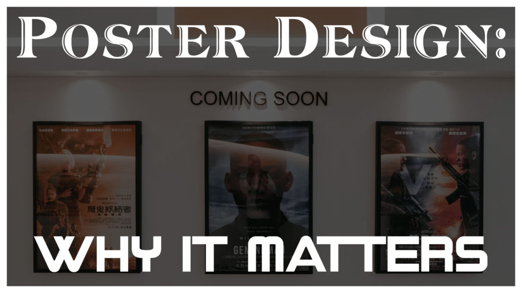
There are few things more synonymous with film than the movie poster. Throughout the entire cinematic experience we are surrounded by these rectangular displays of artistry and design: in the halls and lobbies of the theater, in the newspaper accompanying reviews or show times, on websites that traffic in movie news or box office gross, and even usually (in modified form) on the box art of the physical release. Despite this, it might be easy in modern times to overlook the significance of a well-designed movie poster – after all, in an age of endless teasers and trailers, and the rise of associated social media marketing, the notion of a physical piece of paper with text and images can seem almost quaint. That said, I would argue that that the continued existence of the concept of the poster, and the importance of artistry and care with which it is crafted, is still of paramount importance within in the world of film and to the enjoyment of the audience.
Early Poster Design (A Super-Brief History)
Movie Posters, much as they are today, began as a way to get potential audiences interested in an upcoming feature film. Initially, they often depicted hand-drawn illustrations of scenes from the movie with little mention of the stars. From there, slowly but surely, design ascetics changed and WHO was in the movie became just as much of a selling point as WHAT the movie was about. Faces and names of old-Hollywood stars dominated the page. At the same time, the initial multitude of sizes offered was slowly standardized to what we now refer to as the “one-sheet” (or 27×41).
As time marched on, illustrations were eventually supplanted by real-life photographs as the primary visual cue on most posters (though not entirely) and the designs began to find more creative ways and styles with which to display their titles. From wild fonts to interesting placement, creativity was king as studios fought to draw crowds to see their next big blockbuster. In truth, the decades between the 1970’s and the 1990’s saw the creation and release of some of the most iconic poster designs of all time. Unfortunately, this time of relative plenty was soon to go the way of the Dodo as a trend towards greater standardization began.
Modern Posters: Cookie-Cutter Design
I should preface this section by first stating that everything I am about to say is merely a broad generalization and does not apply to all modern movie poster design choices – in fact, there are a great many which break these molds (or helped created them) and to whom these complaints are not levied. Now that that is out of the way….
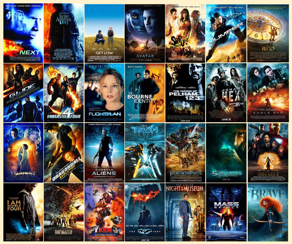
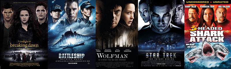
Beginning around the turn of the new millennium (there is no exact date as this was not some sudden overnight shift, but a gradual process) movie poster design evolved yet again. Studios and marketing departments noticed, or at least began to more aggressively embrace, many aesthetic choices that would soon come to dominate the landscape – the (over)use of colors on opposing ends of the color spectrum (teal and orange being perhaps the most common example), the floating heads of the cast over the title of the film, and the superhero standing (or kneeling) stoic as they look over the city, just to name a few. While there are so many more examples I could cover, the point of this article is not to knock a single trend or concept. Each of these ideas, when viewed as a singular work in the abstract, can be a perfectly fine (if sometimes bland) representation of the film in question. Indeed, many of these choices (particularly those related to color) are based on well-known and long-standing artistic principals.
That said, the stripping of context from a particular work should not be a prerequisite for appreciation. For as much as posters are intended as tools with witch to market a film, they are also works of art in their own right. People frame and display them in their homes or offices and just the very sight of the best ones can renew and ignite a flurry of emotions derived from instantly recalling a viewing of the film itself. As a result, movie posters are far more than just the blunt instruments of title-and-cast-deliverance that the much of the modern landscape has made them out to be. At their best, they are stand-alone artistic creations that can also inspire or rekindle appreciation for the movie they are promoting.
While it would be easy to make an entire article disparaging the multitude of modern lazy design choices on display within the medium today (in truth, so many already exist so as to make any such attempt on my part a moot point), that is not what I hope to achieve here. No, in the following paragraphs I hope to explore the importance of a good poster design and some of the creative choices that set the best ones apart. Rather than focusing on the negative, I want to celebrate the positive and try and examine the lessons-learned from them on how to craft visually striking and memorable poster designs in the future.
Theme, Theme, Theme
Perhaps the most basic, and most oft-overlooked, component of a well-designed poster is its focus on the theme of the film. Such focus can take many forms, from the fictional logo and branding heavy posters of Ghostbusters and Jurassic Park, to the ripped paperback trade design astatic of Pulp Fiction. There is also the warped and distorted view of reality displayed by Fear and Loathing in Las Vegas or the pumpkin and knife combo that is the original Halloween – and don’t even get me started on all three posters in the Back to the Future trilogy, with the iconic DeLorean door and the main character staring at a watch (to say nothing of the mirrored and updated design across the lot). In all cases, the result is the same: the viewer is left with a strong impression of the type of film they will see if they go to the theater. While specific plot points are never revealed, a general sense of at least the basic premises (or tones) can be gleaned: it’s about a unique business that goes awry, a collection of seedy stories dripping with sexuality, a drug fueled trip through the desert, murders on a holiday, or the very concept of time.
Not only is a strong and apparent theme important in clueing in (and hooking) the hitherto unaware prospective audience member, it also allows for a greater connection with the audience after they have seen the film. Small details or connections which may have been glossed over in an initial viewing become apparent and only further cement this static work of art with the collection of sounds and moving images that comprise the work of visual media it represents. As mentioned above, if this is done right, a cinema-goer need only look at the poster to be instantly transported back into the state of mind they experienced while watching the film. Such a feeling not only brings a smile to their face, but compels and entices them to re-watch the movie in question. In that way, a poster dripping in theme finds utility on both ends of the cinematic experience – before the film has been seen (as a glimpse of what is in store) and long after (as a loving reminder of a past viewing).
Creativity and Uniqueness
While one would think this would go without saying, the above examples of modern cinematic trends have proven otherwise: a good poster design does something unique and different from its contemporaries and (hopefully) stretches the bounds of creativity within the medium. While that is certainly a lot to ask, in many ways it is also the bare minimum – after all, isn’t the point of a poster to stick out from its surroundings and draw the viewer into actively deciding to go see a film? If the look and feel of a poster blends in with all the other posters around it, then (in my estimation) it has been an abject failure.
But merely stating “Be Unique” with no further elaboration is hardly helpful and the general layout and requirements of a poster are somewhat standardized (title, assorted credits, a release date). That is not, however, carte blanche to just recycle the same old ideas and ascetics because “they worked last time.” In fact, far from requiring a re-invention the wheel, having limits or restrictions on possibility has been shown to increase creativity. That every poster has the same 27×41 space to work with is nothing more than a reality of the medium and exactly the type of limitation that makes its optimal use such a rewarding accomplishment.
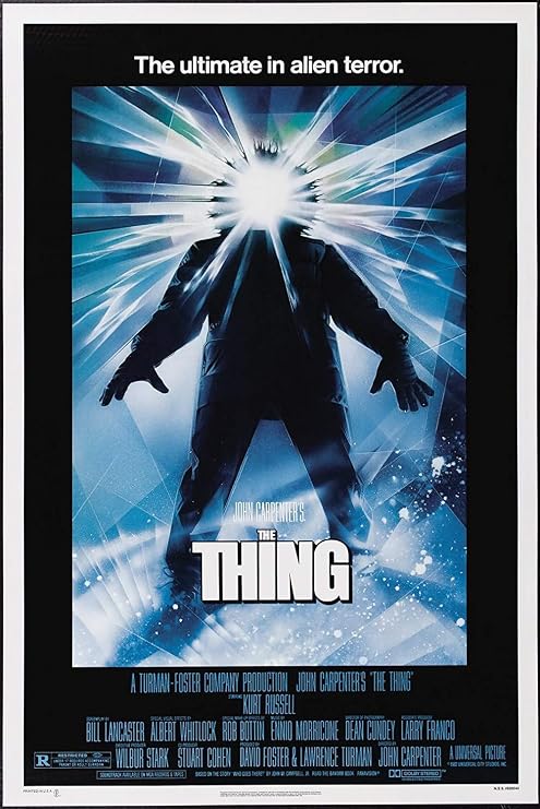
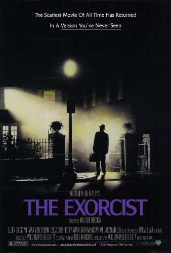
Just as in the film itself, the old adage remains true: Give the people something new. Perhaps it is using a collection of stills from the film to create a larger image of its star as in The Truman Show, or the altered riff on The Creation of Adam by Leonardo Da Vinci seen in the poster of E.T. The Extra-Terrestrial. Maybe you want to show a faceless (and thus unknowable) man consumed by an overwhelming force as in John Carpenter’s The Thing or showcase one of the stand-out visual images from you film as in The Exorcist. Finding a new and different way to showcase what makes your film special, while working within the bounds of the medium, is a key component to making a lasting impression.
Simplicity Itself
This final rule, while certainly not a requirement for a good poster, has helped craft some of the most eye-catching and memorable to have ever existed. Instead of filling the page to the brim with as much iconography and action as possible, head in the exact opposite direction. Attempt to de-clutter the piece and distill the film to its most basic premise. The stark simplicity, especially when compared to the busy frames of those around it, will allow the audience to quickly and easily understand the premise and connect to the concept. It also has the wonderful benefit of typically being more aesthetically pleasing. The world is a busy and complicated place and the ability to focus on a single image or object, to cut through the noise with an impactful transmission of ideas, is often felt by the viewer to be a great relief.
Simplicity also allows for another, ever more important, benefit: universality. In the modern world, media of all stripes is exported and enjoyed throughout the world. Moreover, the “overseas” box office totals for many films usually far outweigh those accumulated domestically – like it or not (and who doesn’t want a bigger audience?), the future of film is global. As a result, being able to efficiently and effortlessly communicate the premise of a film across all language barriers can be a huge advantage. Images are universal and can often allow those of any nationality to just ‘get’ a concept. The starker and more primal the method of communication, the better. Such posters can be exported and recognized the world around, with little effort needed for any sort of localization.
To give examples of iconic and timeless posters that took advantage of the notion of simplicity one need look no further than any list of the best posters of all time: Scream, Star Wars Episode I: The Phantom Menace, Batman, Full Metal Jacket, Ghostbusters, Jurassic Park, American Beauty, Alien, and (the king of them all) Jaws. Each of these posters manages to condense the entire premise and tone down into one stark image – usually nothing more than a body part, a logo, an object, and animal, or a single person whose shadow portends their future. These posters not only set the standard for what minimalism is able to achieve, but also ooze an understanding of the previous two concepts. Each expresses the theme of the film near-wordlessly while also finding a unique and creative way to communicate it to the viewer.
Why Posters Matter
But even if you agreed with all of the design philosophies expounded upon above, the basic question still remains: “In the grand scheme of things, and especially given the abundance of other, more technologically savvy ways, of promoting a movie, why does having a good poster even matter?” Oh, let me count the ways.
As mentioned at the outset of this discussion, movie posters are still ubiquitous throughout the cinema-going experience. Moreover, the digital versions of these posters are posted and shared across social media, speculated upon by rabid fans, and used as wallpapers and backgrounds for phones and computers alike. This very ubiquity, whether a relic of a bygone era or a seminal part of the film experience, necessitates their continued creation. And if they are, in fact, a necessary part of the process, then it only stands to reason that every attempt be made to ensure that they are of the highest quality possible – such posters are a reflection not only of the films themselves, after all, but of the countless hours of work and passion put into them.
Posters often also serve as most people’s first (and thus most important) introduction to a movie. Radio Ads require they be tuned to the station, TV Ads that they don’t use their DVRs to skip commercials entirely, and online trailers that they search them out and devote a full two-and-a-half minutes to their viewing – posters, on the other hand, only necessitate a brief glance in the their general direction to instantly hook an audience. A good design can not only lure someone from across the room for a closer look, it can sell them part-and-parcel on the concept. People are busy and the time they wish to dedicate to being sold on anything is minimal – as such, a beautiful and effective poster is perhaps the most cost-effective ways of ensuring some form of engagement or awareness (if not, optimally, outright excitement).
Finally, good poster design is important because, as discussed above, they are more than just a crass advertisement for a product. Like the films they represent, they are (or at least can and should be) works of art all their own. They tell a story, make a connection, evoke a feeling, and incite an idea in the mind of the viewer. The can be clever and aesthetically pleasing, hanging proudly alongside ‘traditional’ 2D artworks in homes and museums alike. They are collectible, displayable, and permanent physical manifestations of characters and stories that we love and of all the magic that is cinema. They allow for a quick and readily available connection to all of the feelings and emotions we engender to the film itself, while also allowing for a range all their own. In some cases, such as that of Attack of the 50 Foot Woman, their own appeal and creativity outstrips that of the film they were birthed to promote. In short, poster design matters for all of the same reasons that good composition, a compelling story, or a catchy beat matters – they are individual works of art which can be, and often are, judged on their own merits.
Conclusion
At the end of the day, how you as an audience member feel about or connect with any individual poster or design is entirely subjective. Despite what might be universal praise, a particular poster just might not connect with you – and that’s fine. In poster design, like in all art, beauty is in the eye of the beholder. What is less debatable, however, is the fact that you have been intrigued, moved, excited, aroused, enticed, or enamored with a poster at one point in your life. We humans are intrinsically visual creatures – the aesthetic appeal of the right colors, the proper shapes, or interesting combinations of images scratches a deep and primal itch. Images allow us to connect with stories in ways which are impossible in mere conception alone. This is not to advocate the primacy of purely visual artistry over that of other mediums, but to merely acknowledge the advantages and benefits of the art form in connecting with a viewer (particularly in a limited timeframe).
In summation: Posters are a wonderfully complex and often overlooked art form which are more creatively valuable than being a mere advertisement. They are prolific works of art that inspire the viewer and connect them more closely to the films that they love. A good poster, like a good story, can be timeless.
Now go make a great one!
Chris
P.S. – In a shameless bit of self-promotion, feel free to go see how well I did at following my own rules by checking out the poster for Forbidden Dish over on the page for the film.